If you want to change the appearance of your Storefront WooCommerce theme’s header, you may want to learn some CSS tricks from this brief tutorial.
The WooCommerce Storefront is a simple and powerful theme that is free.
This theme provides you with significant control over your store regarding product presentation and user access. It is free and offers you a plethora of customization options through child themes.
The Storefront theme supports the WordPress customizer, and you can edit the header from this section.
However, you can customize the storefront header using filters. However, it is easier with CSS to add your rules to change a particular section’s styling. For this tutorial, you need to have some coding skills. We will add the CSS rules in the Additional CSS section via the customizer.
The advantage of using this section is that the WordPress customizer allows you to edit in a real-time manner. You can see the changes you make before you can publish your changes.
It is also worth mentioning that the Storefront theme needs to be the active theme when customizing it.
With that said, let us look at some header CSS tips that you can use to take your store to the next level.
- Customize Header Size
Here we will use the Theme Customizer again, but we will write some CSS code in the ‘Additional CSS’ section.
Add the following code:
* Masthead */

#masthead.site-header {

    height: 155px!important;

    margin-bottom:0px

}

/* Mobile CSS for Masthead */

@media only screen and (max-width: 320px) {

    #masthead.site-header {

    height: 80px!important;

    margin-bottom:0px;

}

}

/* Masthead menu */

.storefront-primary-navigation a, .cart-contents a {

    margin:0 0 0 0;

}

.main-navigation ul {

    padding:0 0 10px 4px!important;

}

.main-navigation li {

    height:38px!important;}

/* Mobile CSS for Masthead menu */

@media only screen and (max-width: 320px) {

.main-navigation ul {

    background:#D6DDE4!important;

}

}

/* Header area */

.site-header {

padding-top:0.5em;

}

.site-header .custom-logo-link img, .site-header .site-logo-anchor img, .site-header .site-logo-link img {

margin-bottom: -45px;

}
Here is the result: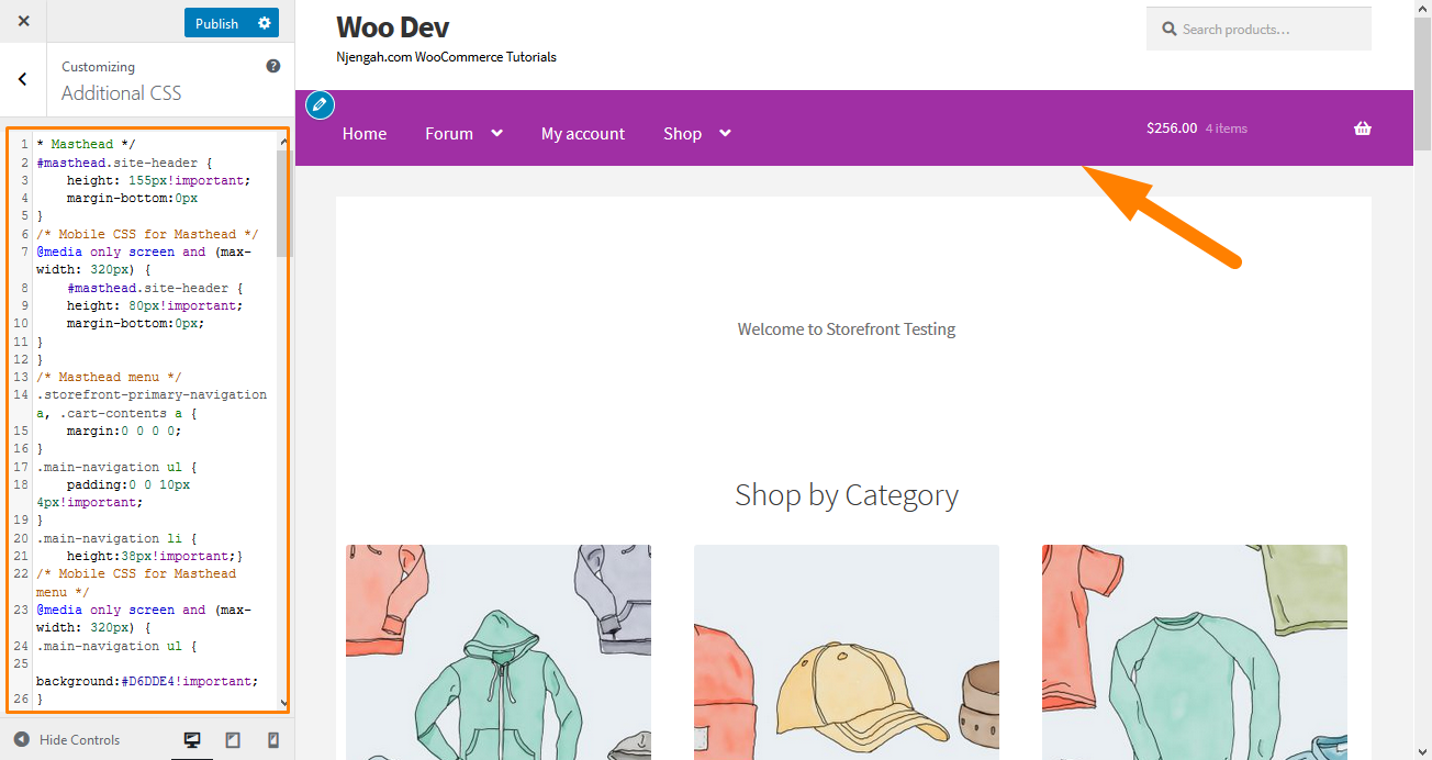
- Remove the Search Bar from the Theme’s Header
Add this code to the ‘Additional CSS’ section.
.site-header .widget_product_search {

display: none;

}
Here is the result: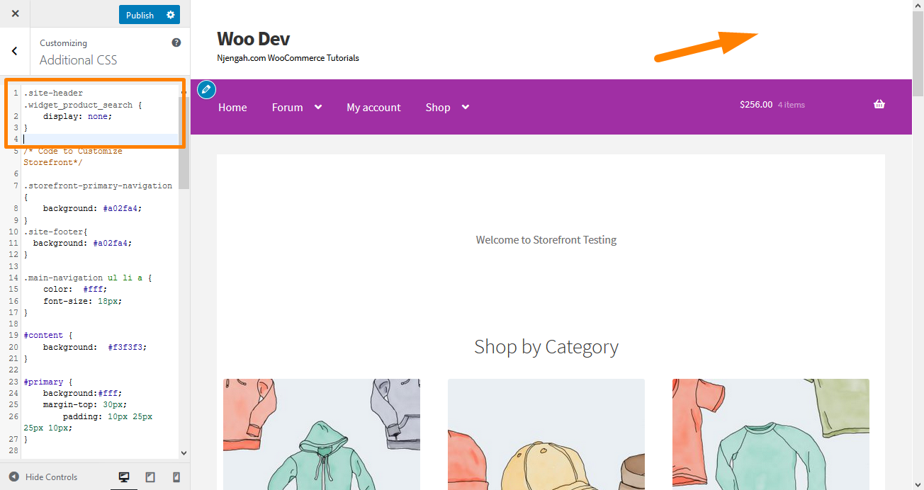
- Change the Header Menu Color
The customizer allows us to customize the header with the colors that you want. You can do this by navigating to Customize, then Header, and picking the color you want.
However, this option colors the entire header region, including the search bar, login section, and logo. To get a different background to the header menu, add the following code snippet to the Additional CSS panel.
.storefront-primary-navigation,

.main-navigation ul.menu ul.sub-menu{

background-color: green;

}
Here is the result: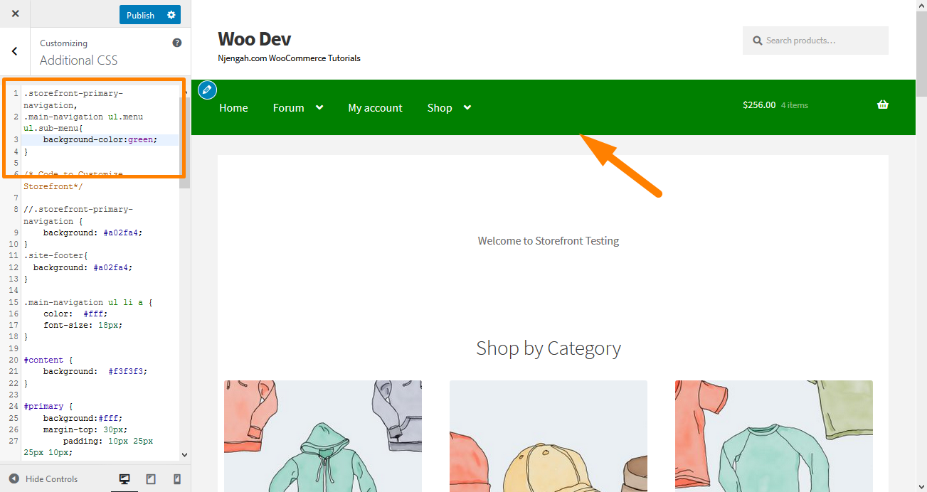
4. Hide the Primary Navigation Bar
Storefront Theme, by default, displays all the pages as a menu. If you want to hide the primary navigation bar, deleting the menu is not enough. Navigate to Customize, then Additional CSS section, and add the following lines:
.storefront-primary-navigation {

display: none;

}
Here is the result: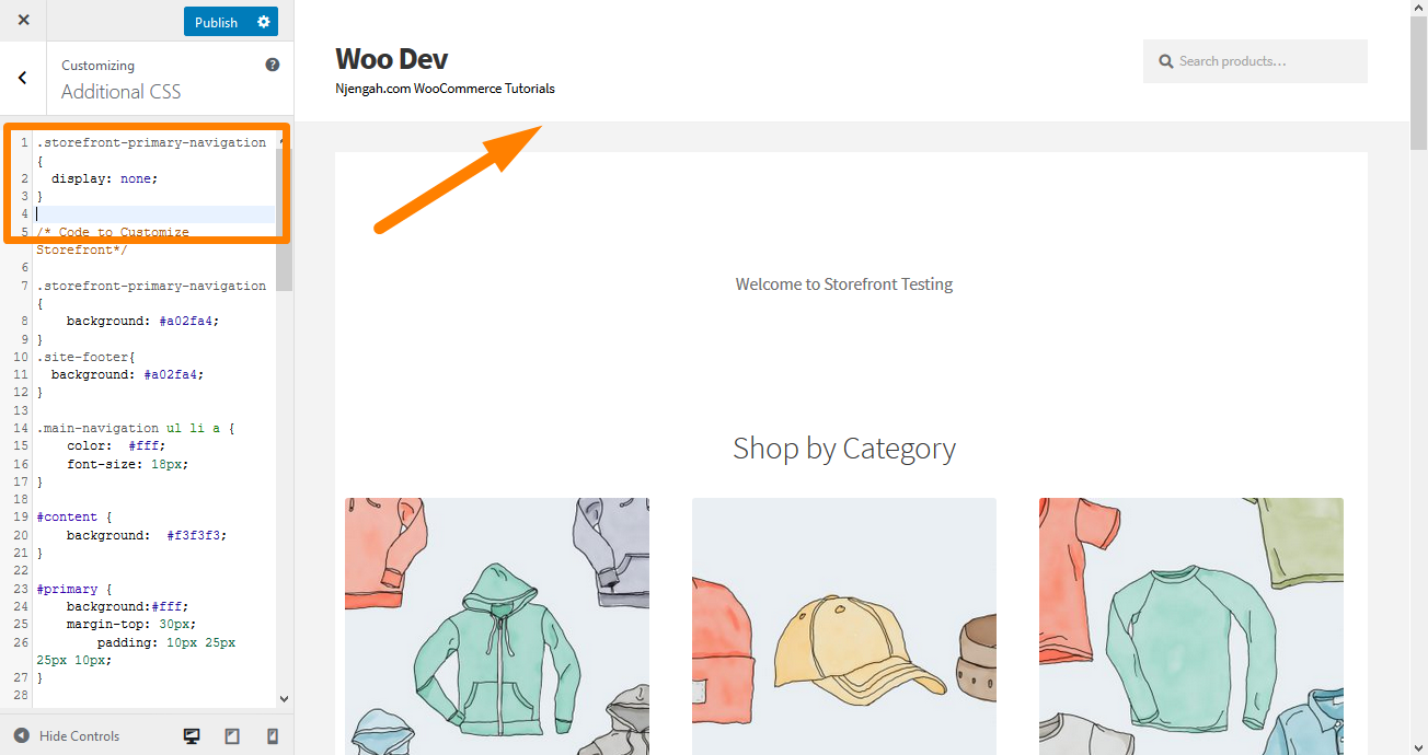
5. Remove Blank Space from the Header
Navigate to Customize, then Additional CSS section, and add the following lines:
.site-branding {

margin-bottom: 0px;

}
Here is the result: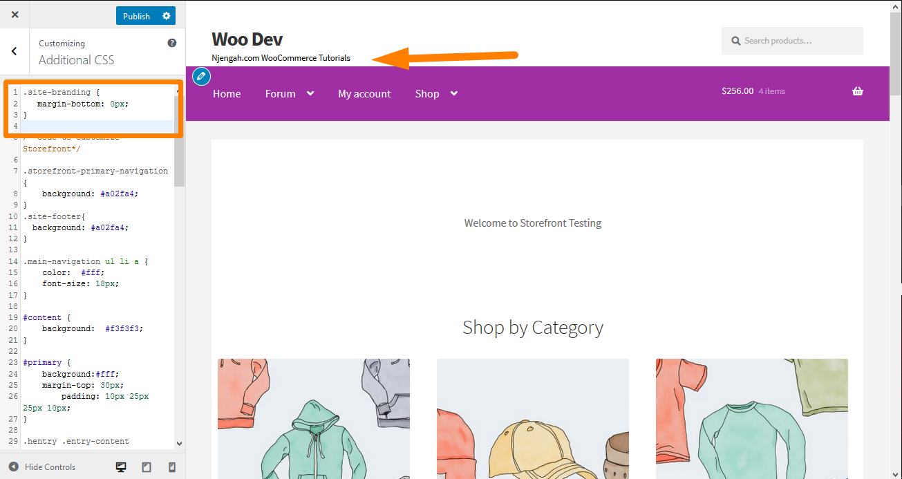
6. Increase the Width of the Search Bar
What would you do if you want to extend the width of the search bar? Using the Additional CSS section, add the following lines:
.woocommerce-active .site-header .site-search {

width: 44.739%;

}

#masthead .site-search .widget_product_search input[type="search"] {

width: 700px !important;

}
Here is the result: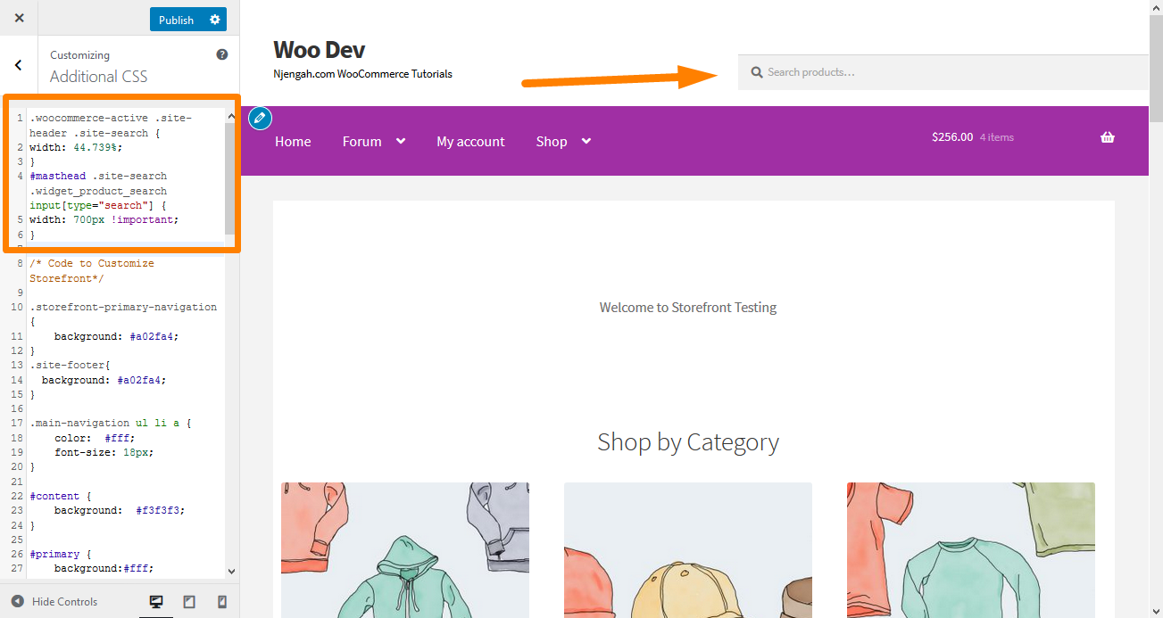
7. How to Change the Size of the Logo, Secondary Navigation, and Search Bar
To change them all at once, add the following code to your Additional CSS section:
@media screen and (min-width: 768px) {

/* LOGO */

.site-header .site-branding, .site-header .site-logo-anchor, .site-header .site-logo-link { width: 30% !important; /* Use px values if you want, eg. 350px */ }


/* SECONDARY NAVIGATION */

.site-header .secondary-navigation { width: 40% !important;  /* Use px values if you want, eg. 350px */ }


/* SEARCH BAR */

.site-header .site-search { width: 30% !important;  /* Use px values if you want, eg. 350px */ }
Here is the result: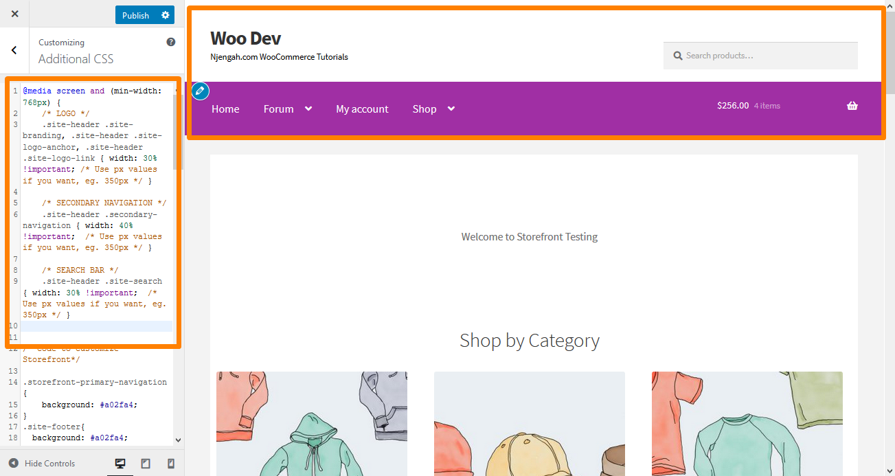
8. Remove the Cart from the Header
In this example, I will remove the cart icon by adding a new rule ‘display: none;’. Add the following CSS code in the Additional CSS section:
.site-header-cart .cart-contents {

display: none;

}
Here is the outcome: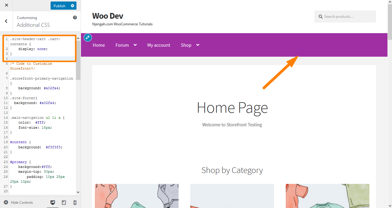
9. Hide the Header
To hide the header, add the following CSS code in the Additional CSS section:
.site-header {

display: none;

}
Here is the result: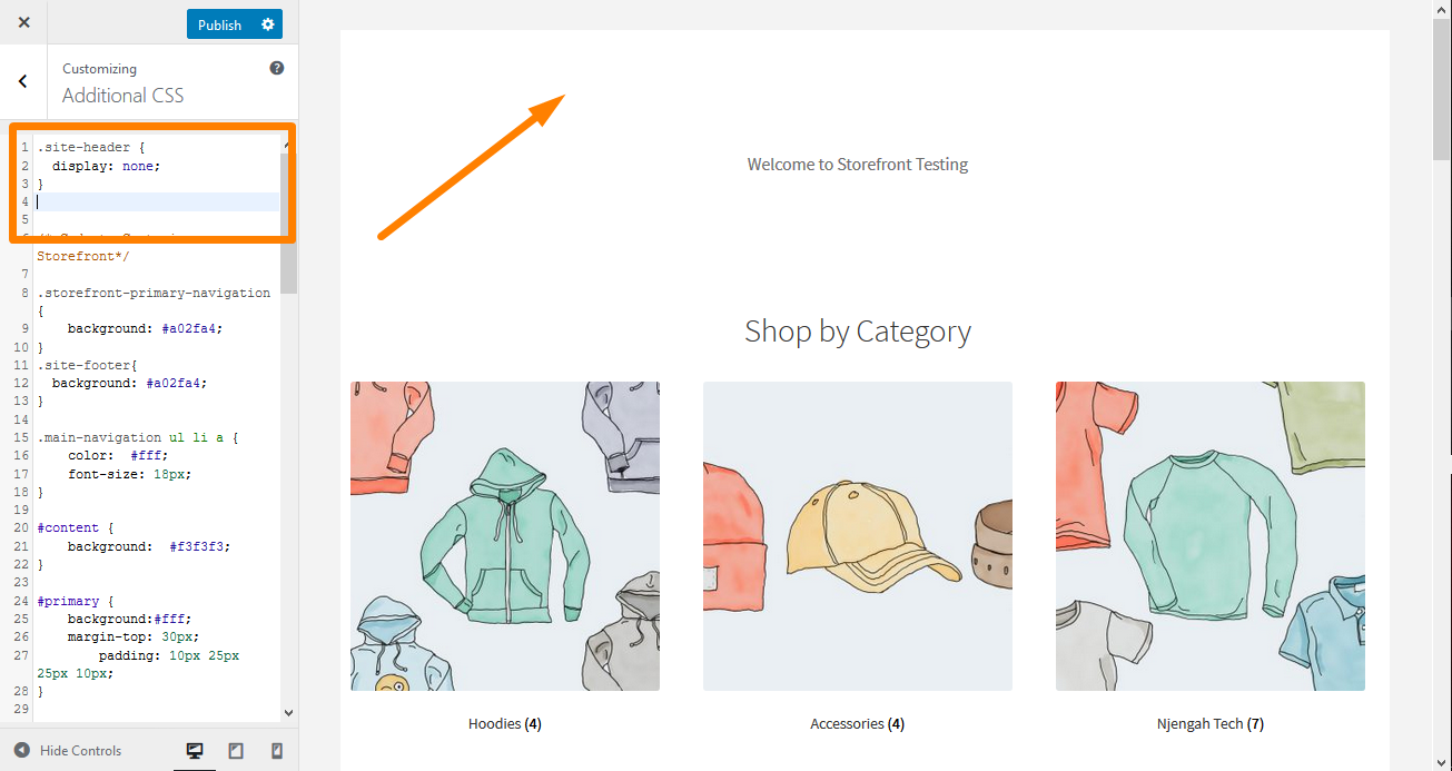
10. Increase the Size of the Menu Link in the Storefront Header
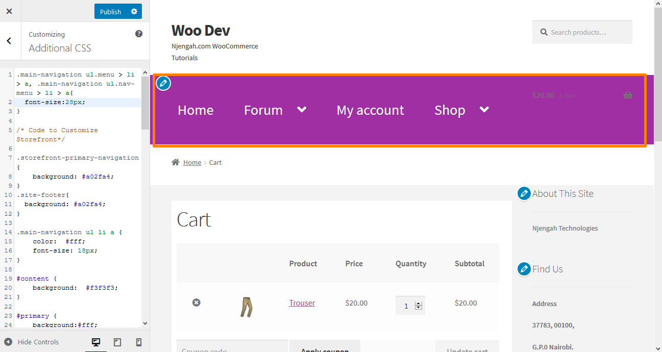 Menus are slightly smaller, according to the preferences of many users. However, they need to upgrade the font size of menu links in the storefront theme. Add the following code in the Additional CSS section:
.main-navigation ul.menu > li > a, .main-navigation ul.nav-menu > li > a {

font-size:28px;

}
Here is the outcome:
11. Change the Size of the Cart Icon in the Storefront Header
You can do this by adding the following CSS code in the Additional CSS section
.site-header-cart .cart-contents {

font-size:30px;

}
Here is the result: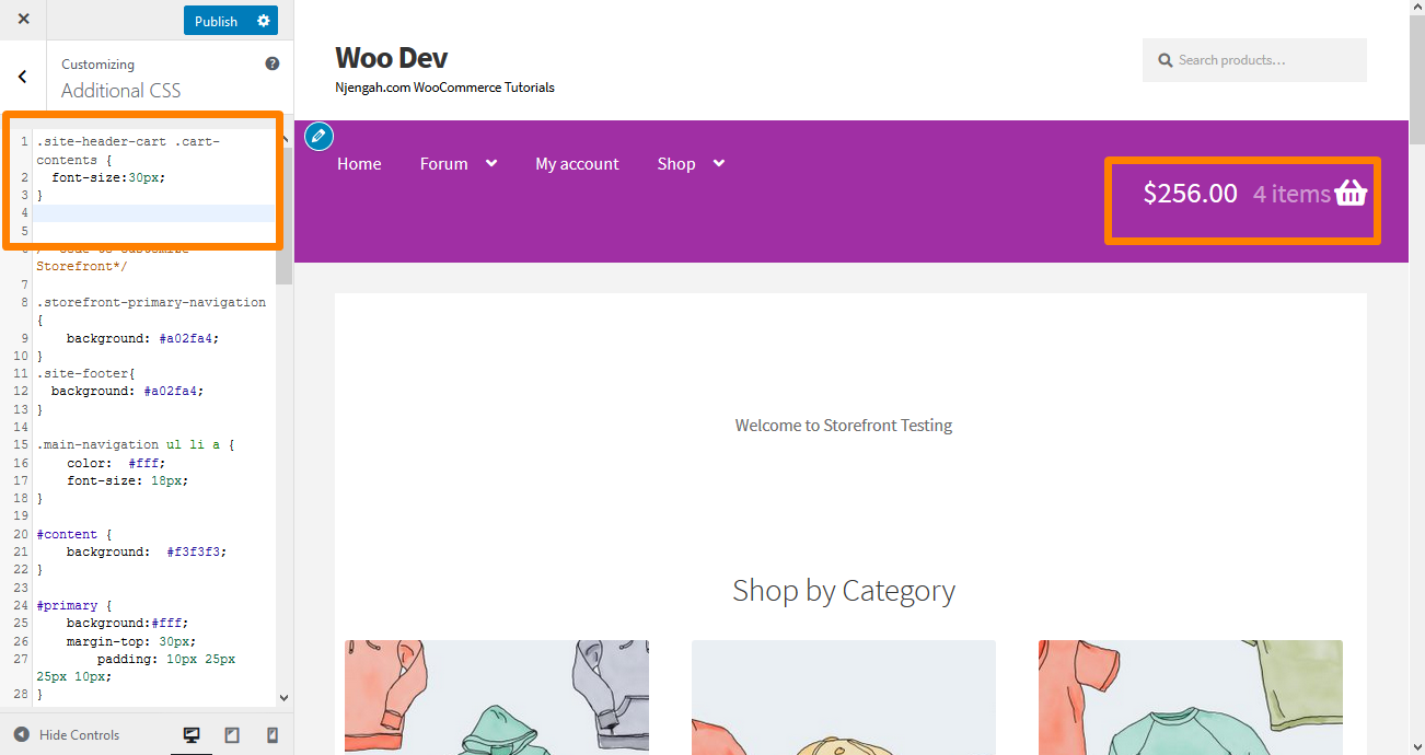
12. Change the Size of the Site Header Title in the Storefront Theme
Add the following code in the Additional CSS section:
.site-header {

font-size: 20px;

}
Here is the outcome: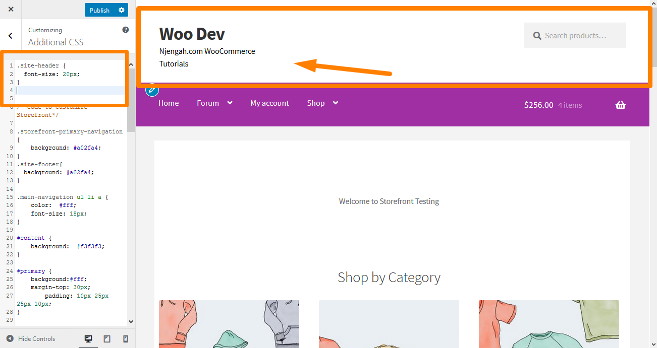
13. Change the Size of the Mobile Menu Button
It is important to note that the way the menu is displayed is part of making the menu responsive.
Therefore, if your primary navigation menu is in the form of a list on a desktop device, the same menu can be displayed as a hamburger menu on a mobile device.
To change the size, add the following CSS code in the Additional CSS section:
.button.menu-toggle {

font-size: 19px;

}
Here is the result: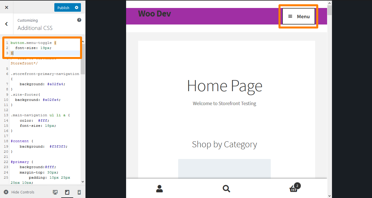
Conclusion
In this guide, I have shared some header CSS tips that you can use to style the header.
I highly recommend that you add the CSS rules in the Additional CSS section so that you can preview the changes in real time.
Previewing your changes will allow you to change the rule to your specification.
To add the rule, copy/paste it into the “Additional CSS” section of your Storefront theme customization interface. To do this:
- Log into your WordPress site and access the Dashboard as the admin user.
- From the Dashboard menu, click on Appearance Menu > Customize.
- Navigate down to Additional CSS in the left sidebar that appears.
- Add the CSS rule.
- If you are satisfied with the changes, click on Publish.
However, it is essential to note that the CSS tips shared here only work for the Storefront theme.

Joe is an experienced full-stack web developer with a decade of industry experience in the LAMP & MERN stacks, WordPress, WooCommerce, and JavaScript – (diverse portfolio). He has a passion for creating elegant and user-friendly solutions and thrives in collaborative environments. In his spare time, he enjoys exploring new tech trends, tinkering with new tools, and contributing to open-source projects. You can hire me here for your next project.
Similar Articles
- How to Create Custom Widget Area in WordPress Step by Step
- How to Customize Storefront Theme – Homepage Customization [Ultimate Guide]
- How to Add Storefront Theme Header Background Image
- How to Edit Header in Storefront WooCommerce Theme
- How to Make Divi Mobile Menu Scrollable Quick Fix Solution
- How to Change the Size of Cart Icon In WooCommerce Storefront Theme
- How to Change the Size of Mobile Menu Button Storefront Theme
- How to Adjust WooCommerce Storefront Height of Header
- How to Change Main Menu Font Size Storefront Theme
- How to Change WooCommerce Storefront Footer Height
- How to Change Menu Color WooCommerce Storefront
- How to Customize Storefront WooCommerce Theme: The Ultimate Storefront Theme Customization Guide
- How to Change the Size of Site Title WooCommerce Storefront Theme
- How to Remove Header WooCommerce Storefront Theme