 By
By  If you are familiar with WooCommerce, you know that a mobile-friendly, responsive theme is quite imperative considering nearly 50% of your visitors are bound to view it on a mobile device.
It is important to note that the way the menu is displayed is one part of making the menu responsive. Therefore, if your primary navigation menu is in the form of a list on a desktop device, the same menu can be displayed as a hamburger menu on a mobile device.
WooCommerce Storefront Change Size of Mobile Menu Button
If you look at some websites on a smartphone, the menu items just do not look right. If the menu button is misaligned or there are simply too many options or it fills the entire screen, it can easily be a distraction for many visitors.
The best way to implement a stylish responsive menu is by using the right theme. The Storefront theme automatically makes this a part of the theme’s overall design. However, the menu button might be very small and you may want to increase the size.
In this brief tutorial, I am going to show you how to change the size of the mobile menu button that looks attractive on virtually any device. However, I will use CSS to make the customization.
Steps to Change the Size of the Mobile Menu Button
Here are the simple steps that you should follow:
- Identify the Element you need to Change
Simply right-click on any area on your homepage in a browser like Chrome or Firefox and click “Inspect Element” like this: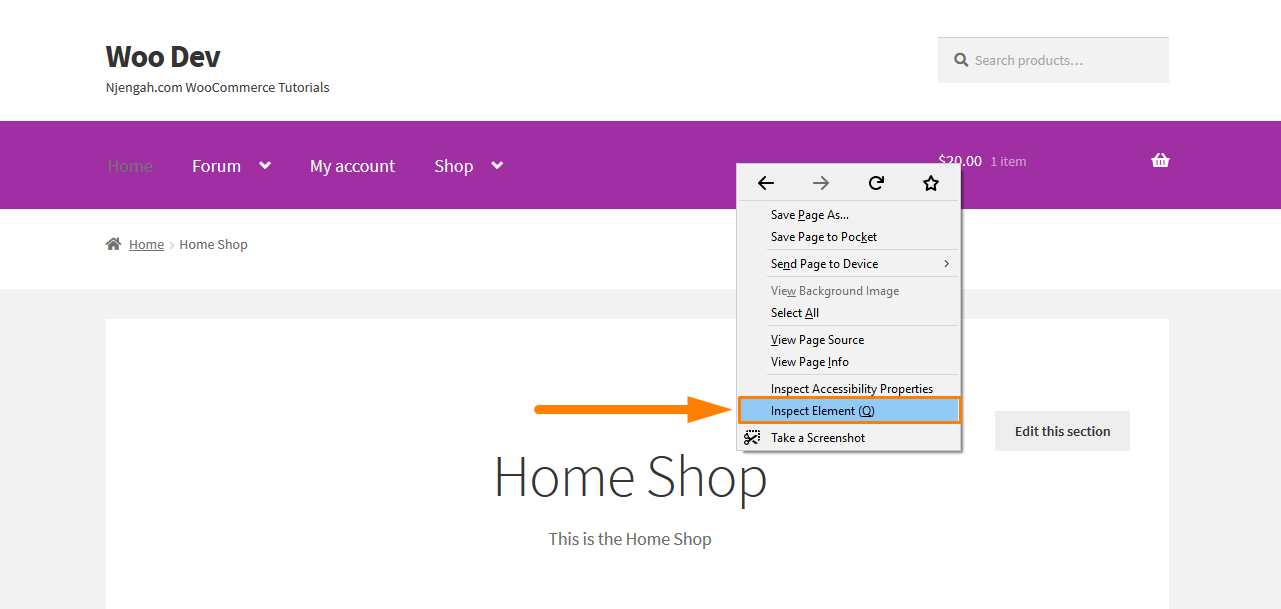
After clicking on that, this will bring up the console containing the various elements of the page on the left and the settings for those elements on the right. Now you need to find the element that targets the mobile menu button and we can add a new rule.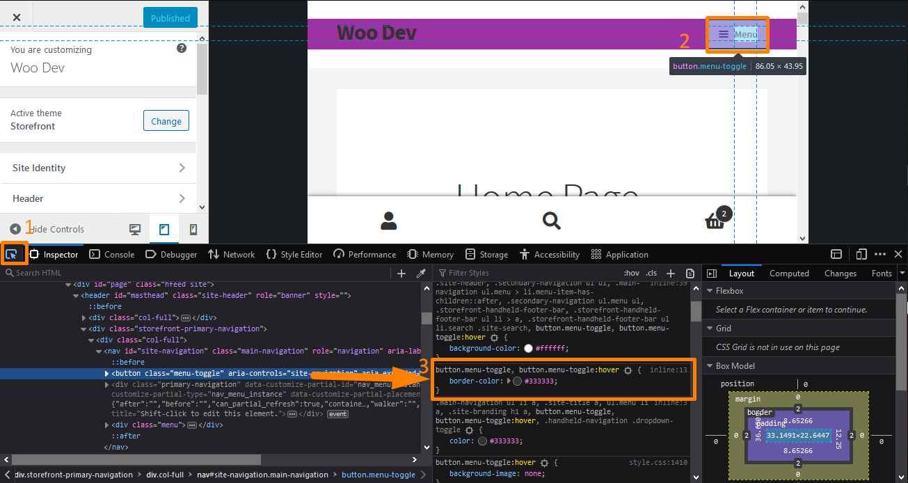
To select the element, click on the element picker as shown in the screenshot. Then point the cursor to the menu element to check the styling.
- Choose your Desired Size
Now that the hard work is done, the next step is to enter your CSS rule. You need to enter something like “font-size”, press tab, and type in the size you want.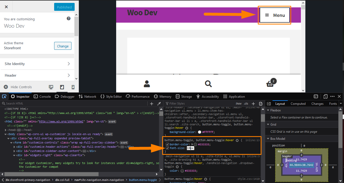
I have changed the size to 19px, and you can see that the icon is visible in the browser. You can experiment to get your desired size and when you are satisfied with your changes, it is time to make it permanent.
- Extracting the New Rule
You need to extract the rule by right-clicking it (on Firefox) like this and selecting “Copy Rule”: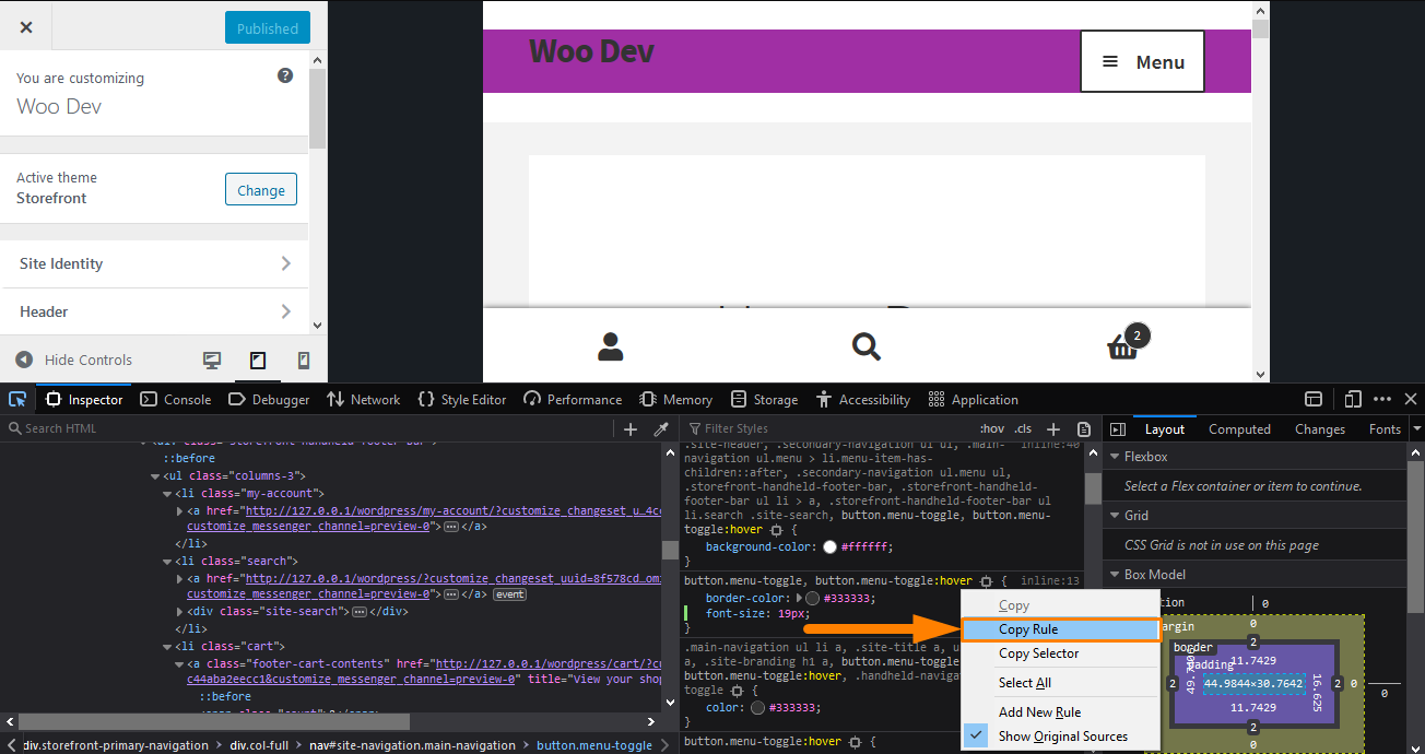
However, if you are using Chrome, you can just select the entire rule with your mouse and copy the text. Paste it into an editor and delete all the existing rules except for the new one you just added if there are any.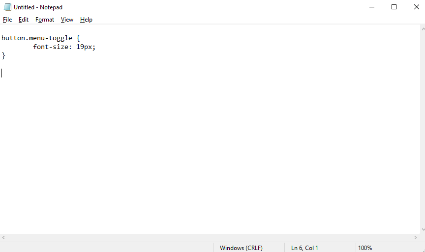
- Adding the Rule
The remaining part is to copy/paste into the “Additional CSS” section of your Storefront theme customization interface. To do this:
- Log into your WordPress site and access the Dashboard as the admin user.
- From the Dashboard menu, click on Appearance Menu > Customize.
- Navigate down to Additional CSS in the left sidebar that appears.
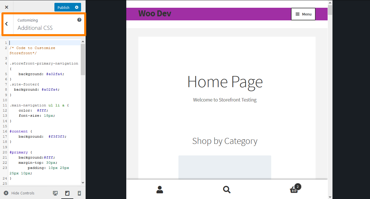
- Add the CSS rule as shown below:
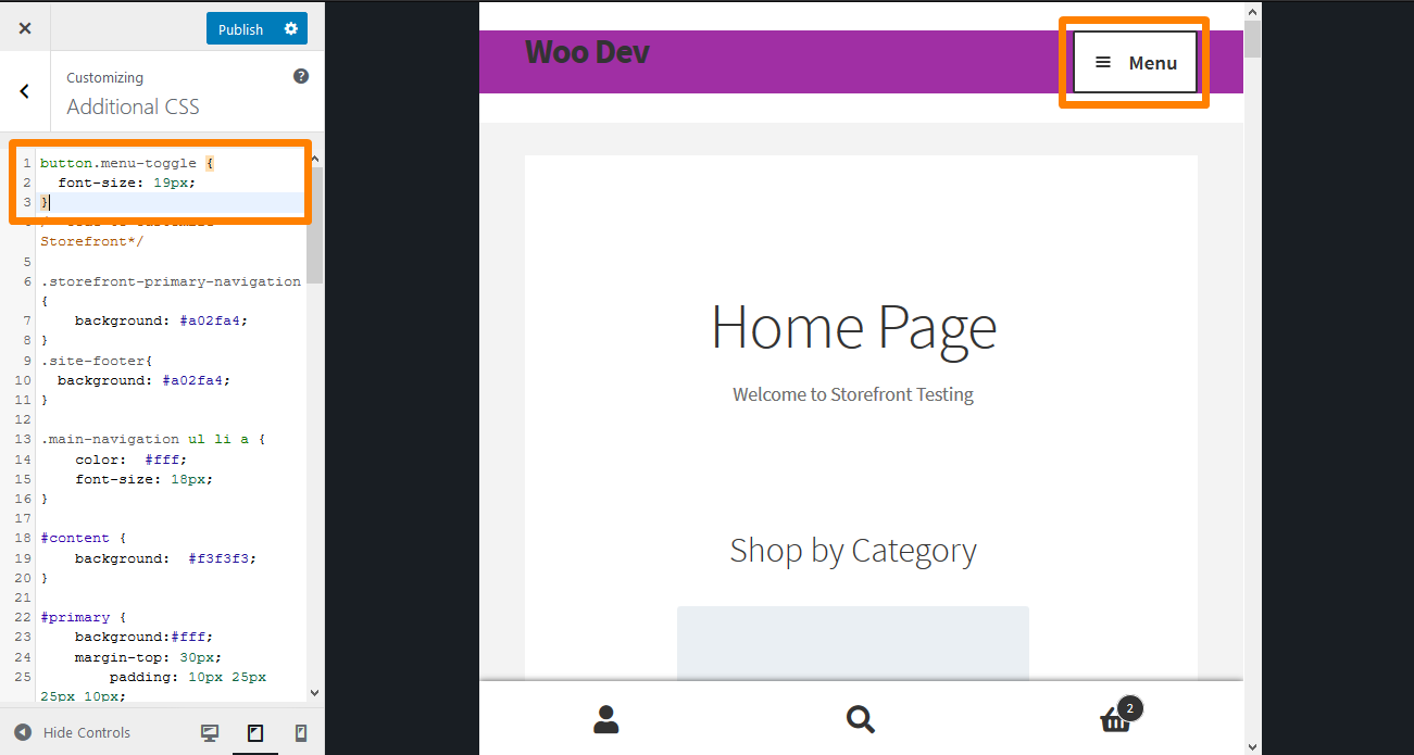
- If you are satisfied with the changes, click on Publish.
Conclusion
It is as simple as that. Resizing the mobile menu button is very easy and as I have highlighted, the trick is to find the right element and the right rule to change. Mobile menus are important because nearly 50% of your visitors are bound to view it on a mobile device. Therefore, your WooCommerce store should be responsive so that users cannot be distracted because of too many options on the menu or if the menu fills the entire screen.
After identifying the element, you need to choose the preferred color. The console area allows you to enter your CSS rules, but this does not make any actual changes to your site. It allows you to experiment with your rules and see them in action before implementing them on your site.
Similar Articles
- How to Create Separate WordPress Posts Page or Blog Page
- 80+ Tricks to Customize Storefront WooCommerce Theme : The Ultimate Storefront Theme Customization Guide
- How to Add New Menu in MyAccount Page Menu in Woocommerce
- How to Add Active Navigation Class Based on URL
- How to Make Divi Mobile Menu Scrollable Quick Fix Solution
- How to Adjust WooCommerce Storefront Height of Header
- How to Remove Bullets from Unordered List in WordPress
Comments are closed.